.png)
AI Product Design · United We Care ·UI/UX Designer
Design an AI wellness coach that users would return to between therapy sessions -one that felt genuinely supportive rather than robotic, for people who were often in real distress.
United We Care had strong therapist matching. Users would sign up, get matched, book a session. Then disappear. Retention at 90 days was the critical gap - there was nothing pulling users back between sessions, and nothing available at 3am when someone needed support but couldn't access a therapist.
STELLA was the answer to that gap. But the design challenge wasn't building a chatbot. It was something harder: designing an AI interaction where the interface itself had to do emotional work. A cold error state, an unexpected tone shift, or a confusing escalation path -any of these could make someone's experience meaningfully worse at exactly the moment they were most vulnerable.
The question wasn't "what should STELLA say." It was "how do you design trust in an AI product for users in distress?"
User research with mental health platform users revealed a key insight: people didn't want AI to pretend to be human. They wanted it clearly AI — but warm, consistent, and emotionally safe. Safe meant no unexpected tone shifts, no confusing error states, no feeling of being judged.
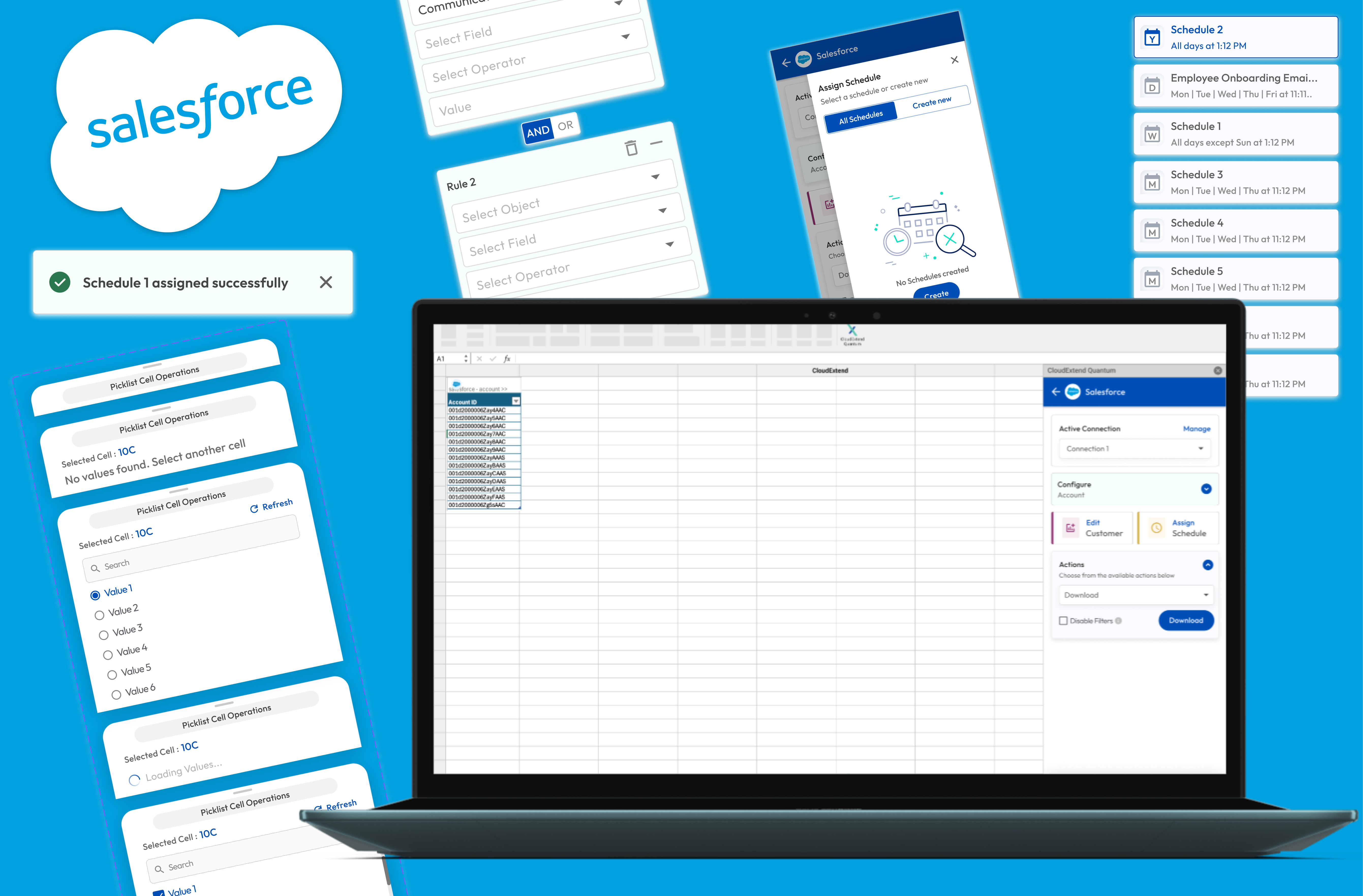
The hardest design problem was the conversation interface itself. LLM responses are non-deterministic — same prompt, different output.
Key decisions:
· Conversation turn structure with clear visual separation between user input and STELLA response
· Emotional safety patterns for edge cases — what the UI does when STELLA produces an unexpected response· "I need more help" escalation flow — frictionless path from STELLA to a human therapist
· Personalisation UI — how STELLA learns user preferences over time without feeling surveillance-like
. WCAG 2.1 compliance was non-negotiable
. Designed for colour contrast, screen reader compatibility, reduced motion, and keyboard navigation across all conversation states.
3 rounds of moderated usability tests with 12 participants. Key changes:
· Simplified onboarding from 7 steps to 4
· Redesigned emotion check-in from text input to visual scale after drop-off analysis
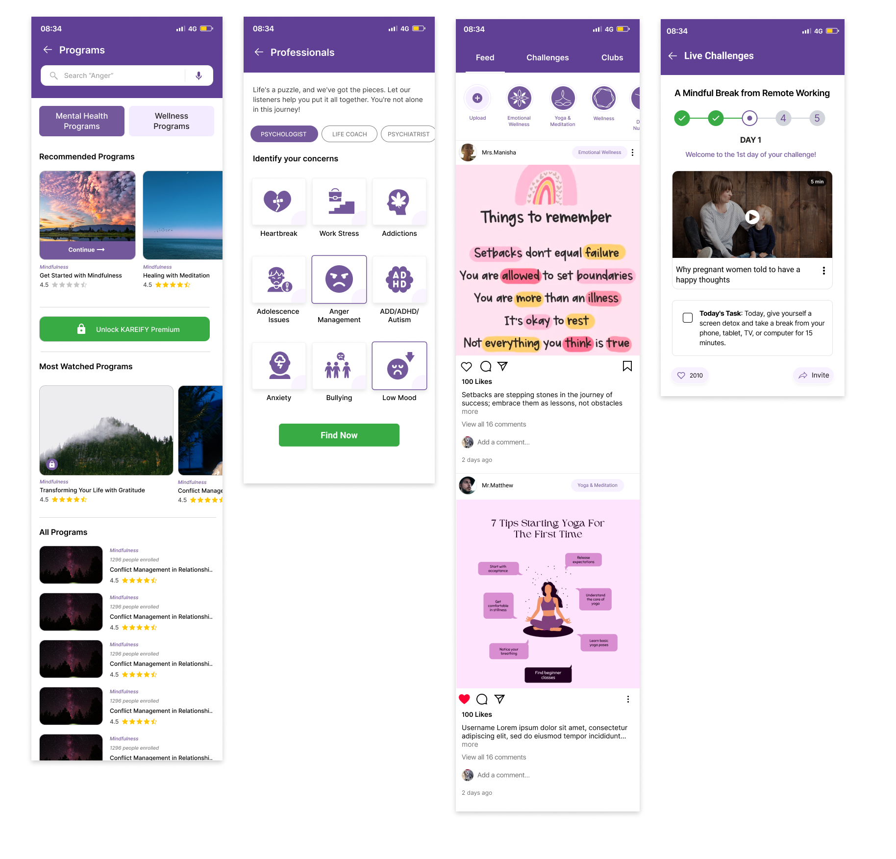
My first instinct was to design the intake as a structured form. Ask users to describe how they're feeling, select their concerns, rate their mood on a numerical scale.
Testing killed it in round one.
Users found forms clinical. Several participants described the experience as "filling out a medical questionnaire." Completion dropped significantly the moment they hit the first open text field. One participant said: "I don't want to write an essay about my feelings at midnight."
That feedback reframed everything. The design problem wasn't information collection. It was emotional entry. How do you help someone who is struggling feel safe enough to start?
.png)
Decision 1 — Visual emotion check-in, not text input
The home screen opens with one question: How is your mood today? Five emoji options - Angry, Anxious, Sad, Happy, Unsure. No text field. No numerical scale.
Post-launch, the mood check-in became the highest-engagement daily touchpoint in the entire product. Users who completed it were significantly more likely to continue into a STELLA session.
What it taught me: in high-emotion products, reducing friction at the entry point is more important than capturing complete information. You can get nuance deeper in the conversation. You can't get it if the user closes the app.
Decision 2 — STELLA as a gateway, not just a conversation
Early STELLA was purely conversational. You talked, it responded. The problem was that conversation alone couldn't hold someone beyond a few exchanges. Once STELLA acknowledged how someone felt and offered perspective — what next? Users closed the app having felt heard for five minutes but with nothing to carry forward.
The shift was making STELLA an entry point to the broader product. When someone mentioned struggling to sleep, STELLA surfaced a sleep meditation inside the conversation. Work anxiety brought up a relevant program — not as a redirect, but as part of the response. The content arrived in the moment it was relevant, not somewhere else in the app waiting to be found. Users who received a recommendation inside a STELLA session were significantly more likely to act on it than users who browsed to the same content independently. Context drove action in a way that navigation never did.
Three features were cut before launch despite being in the original brief.
Mood tracking graphs. Users in distress don't want to see their bad week visualised as a downward line. We removed it.
Social sharing. A user successfully completing a mental health exercise shouldn't be prompted to share it with followers. We removed it.
Streak mechanics. Gamification that punishes you for missing a day is harmful in a mental health context. We removed it.
Shipping a smaller, safer product was the right call. These decisions were harder to make than the design decisions - they required pushing back on product and business stakeholders. The argument I made was simple: one harmful experience in a mental health product costs more trust than ten good features earn.
Retention went up 35% over 90 days. Not because we added more features — because STELLA gave people a reason to come back between therapy sessions. Something that was available at 3am when their therapist wasn't.
Sign-up conversion jumped 20%. We A/B tested the conversational onboarding against the original step-by-step flow. People moved through a conversation. They abandoned a form.
Bounce rate dropped 12% across key funnels.The mood check-in was the first thing users saw after opening the app. In the old flow - the slider onboarding -users who found it clinical or overwhelming would leave before they even reached the core product. That's where the bounce was happening. At the entry point, not deeper in.More users making it past entry meant fewer bouncing from the key conversion funnels downstream.
The hardest part of designing an AI product isn't the interface. It's designing for the moments when the AI is uncertain, wrong, or out of its depth.
Every AI product has a failure mode. The design question is whether that failure mode destroys trust or maintains it. In STELLA, we designed the failure state explicitly — STELLA acknowledges its limits, offers what it can, and hands off to a human clearly and warmly. That decision — designing the uncertain moment as carefully as the confident one — is what I'd bring to any AI product I work on next.

1
Branding
2
Development
3
Quick Support
4
Design Branding
5
UI/UX Design
1
Branding
2
Development
3
Quick Support
4
Design Branding
5
UI/UX Design

RELATED POSTS
Connect with me
.png)